

Are Your Brand Guidelines Stifling Your Designer’s Creativity?
Some things in life don’t change. Haters gonna hate. Creatives gonna create. So what happens when your company’s strict brand guidelines cut off the ability for your designers to be creative? You stop the designers from trying new things and producing their best work.
In my experience working with brands over the years, successful projects come from teams that create brand style guidelines that establish consistency but includes built-in room for designers to flex their creativity and use their expertise to come up with the most effective approach.
Consistency + Creativity: Finding the Sweet Spot
Don’t get me wrong: Establishing a set of standardized brand guidelines is important; it provides designers with the guidance they need to maintain consistency throughout your collateral. The whole reason to have a brand is so people recognize you, so some familiarity is the goal.
But being too rigid in style stipulations when creating these brand guidelines can leave your brand looking stale. Such guidelines could box your designers in, which leads to collateral that will start to look like carbon copies. Your audience will start to get that funny feeling like they’ve seen that brochure/magazine/email/infographic before. Best case: it’s boring — both for your designers and your customers. Worst case: it’s ineffective.
The best brand guidelines avoid common over-engineered mistakes, striking the right balance of providing a framework and allowing enough leeway for creativity to thrive.
6 Tips for Better Brand Guidelines
1. Avoid Getting too Specific.
Your brand guidelines require a lot of thought, and though they should be detailed, they shouldn’t be so specific that a designer has no room to color outside the lines. You’ll want to outline your fonts, colors, photography style, how to use the logo, and that’s pretty much it.
You don’t need to dictate font size, grids, or how to use every element. It’ll save everyone some headaches if you leave those decisions up to the designer. After all, that’s why you pay us.
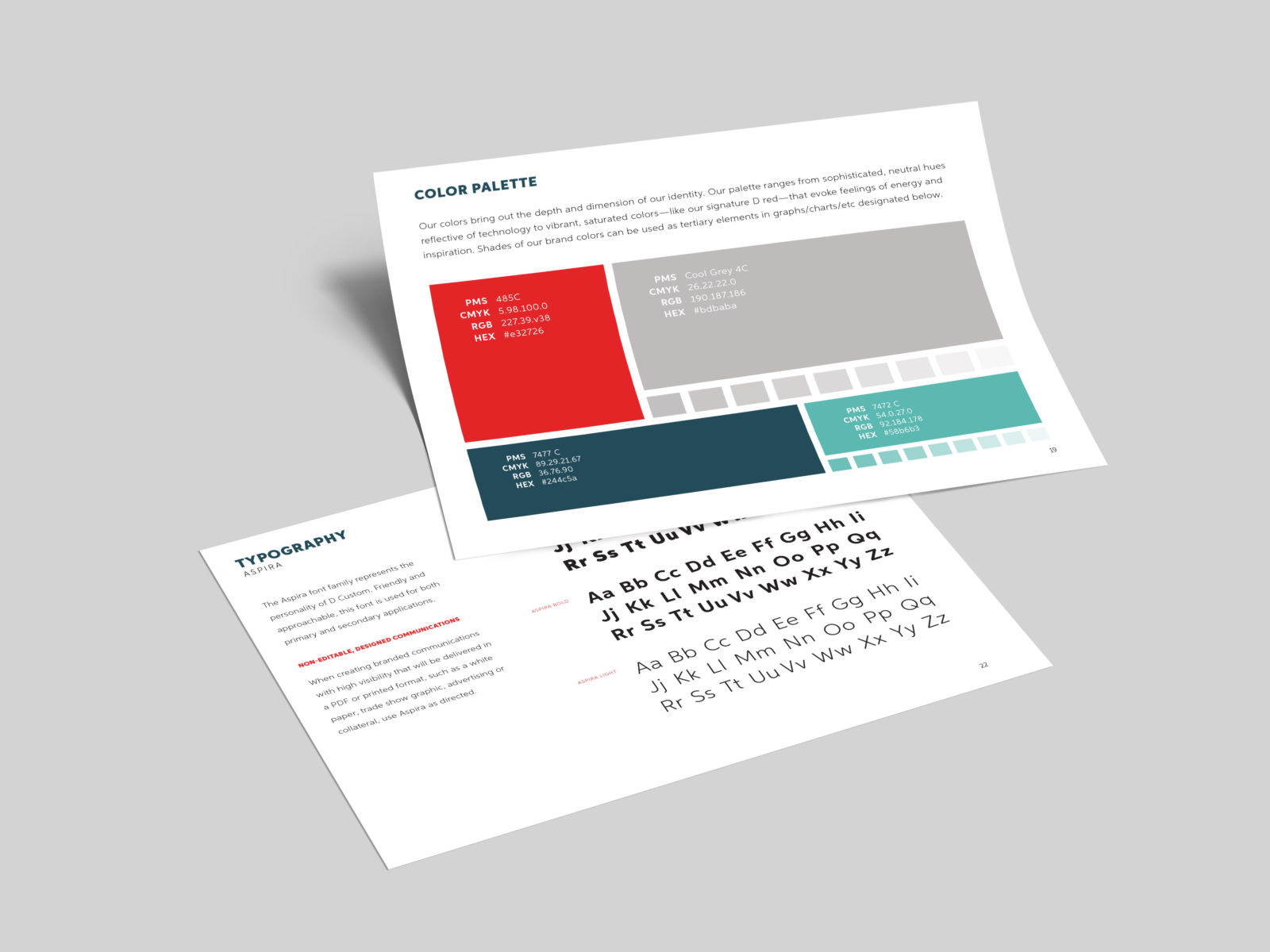
2. Get Colorful.
One common mistake I see within many brand style guidelines is to limit designers to just a few colors. While you may have just two main colors associated with your brand, you should choose plenty of subordinate colors for times when just a couple of colors won’t do. Those primary colors are enough for simpler projects, but infographics, callouts, and basically anything with data represented visually require options.
“50 Shades of Grey” may have had a place on the bestsellers list, but in a pie chart, it leads to confusion and frustration. Different monitors and printers will affect the quality and variation of shades, making it impossible to match the key to the data.
3. Provide Some Examples.
While laying out hard and fast rules about design limits creativity, it’s helpful to set the tone and provide some inspiration to designers as a starting point. Help us out by answering questions like:
- How do you picture a brochure?
- How would this web page look with an ad?
- What were you thinking for magazine covers?
Mocking up some designs can be more effective in creating a cohesive brand than defining every point size and regulating every banner. Providing examples can help the designer understand the feeling and style that the brand is going for while still leaving room for new ideas.
4. Think Through the Usage.
The problems I’ve seen designers run into with brand guidelines often seem to stem from one problem: The team who developed the design system didn’t consider all its potential applications. What works for a white paper may not work for an infographic. A sales brochure may not require the same considerations as a magazine.
By thinking through its most basic uses and creating brand guidelines based only on those, designers will be too limited to effectively execute exciting content formats. Even things as simple as allowing a variety of content lengths or formatting options are often forgotten. Set the font size for headlines, for example, and you’ll find that anything much longer or shorter than you pictured just looks wrong.
5. Make Every Employee a Brand Expert.
If you’re worried about brand consistency, the best thing you can do is to train each employee on the brand guidelines so they know what’s acceptable and what’s out of bounds. While the nitpicky details of these guides are open to interpretation (that’s a good thing), every employee can be a brand expert to find glaring problems when a piece comes across their desk.
6. Update Regularly.
Even with the best brand guidelines, your collateral can start to look stale after several years, so it’s important to refresh your standards every two or three years. I’m not talking a total rebrand — that’s best every five to 10 years. Just check to see if your colors (including those ever-essential subordinate colors) are still fresh. Review whether any aspect has been overused and incorporate new design trends.
It’s easier on everyone if you create brand guidelines that don’t involve strict brand committees, pica rulers, and 100-slide decks. Keep it flexible with room for creativity, and even the haters can’t hate.
For more tips like this, keep an eye on our blog, or contact us for help or feedback on your company’s brand guidelines.
Related Stories
